Ocado ditches green for grape in rebrand by JKR
Text Credit – By Molly Long @designweek
The new look for the online store seeks to set itself up for “significant future growth”, and includes a redrawn logo, custom typeface and redesigned packaging.
Jones Knowles Ritchie (JKR) has rebranded online grocery retailer Ocado, in a bid to further support the growth of the business.
Founded in 2000, Ocado has partnered with other supermarket brands in the UK to expand its offer throughout its 21-year history. Previously, this was with Waitrose and now the supermarket works with M&S.
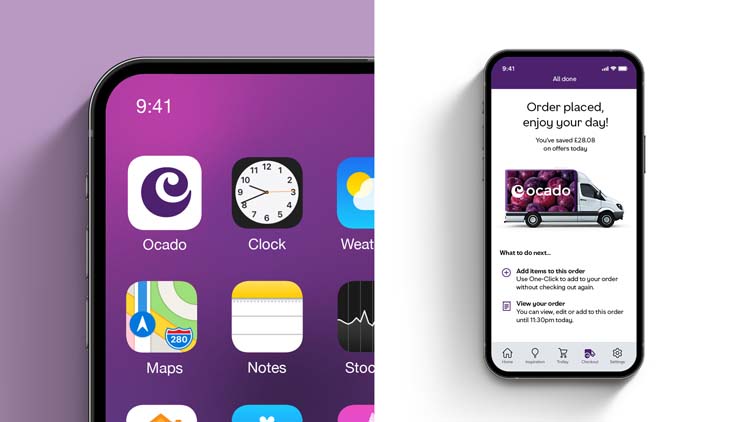
The new identity gives the brand a distinctive and ownable presence, according to JKR. Grape is Ocado’s new brand colour, giving the brand more visibility in a market crowded with greens.
“We really had to look at the colour wheel to find where the spaces were”
JKR was asked to pitch for the project last year, says studio creative director Ivan Mato. The brief outlined a need to mark Ocado out from the other “green brands” in the UK supermarket space.
This requirement prompted a dramatic colour change. Ocado’s brand colour is now “Grape” according to Mato.
“Lots of brands have invested time and money into their brand colours, so we really had to look at the colour wheel to find where the spaces of opportunity were,” he says.
The deep purple hue of Grape, however, is not totally random, Mato adds. He says early Ocado delivery vans often sported a “cabbage” colour, which is similar.
As well as being markedly different to any other supermarket’s branding, Grape is also more accessible, Mato says.
“Grape on white, and white on Grape – the contrast of the colours meant Ocado’s platforms could be more digitally accessible than ever,” he says.
“We didn’t want to go for a very serious-looking sans typeface”
One element of the brand which has been brought forward into the new identity is the Ocado “swirl” logo. Research into perception of the logo revealed it was one of the brand’s most recognisable assets among consumers.
For this reason, Mato says the JKR team “protected it with their lives” and only made very subtle changes to it to ensure it could work at small sizes.
“When the swirl was originally drawn in the mid-2000s, it was for desktop screens,” he says. “In 2021 it needed to be optimised for our new digital world.”
The swirl has also informed Ocado’s new custom typeface, designed by F37 Foundry, and wordmark, which has also been tweaked for clarity.
“With all the character in the swirl, we didn’t want to go for a very serious-looking sans typeface,” says Mato.
“It had to look good in digital form, but it had to look amazing at home”
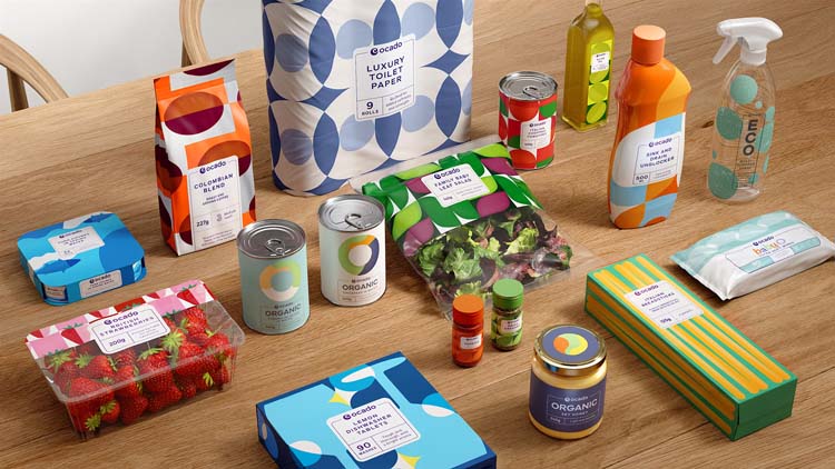
The entirety of the project was about creating an “online-to-offline” design system, Mato says, where products “travel from digital shelves to the ones in the home”. In designing the packaging for Ocado’s extensive range of own-brand items, this approach was especially relevant, he adds.
Packaging for the brand’s own line of products had previously used a swirl motif inspired by the logo. This no longer served the right purpose, Mato says, and didn’t mark out the offering from the more than 50,000 other items sold by the online retailer.
The new packaging sports fabric-like patterns that are each inspired by their respective products. Packaging for dishwasher tablets feature sparkling wine glasses in a repeating pattern, for example, while Ocado-brand olive oil features an abstract olive design.
“It was important to give Ocado’s range a distinct personality online and offline,” says Mato, explaining the team became interested in the idea of being “shelf proud”. “It had to look good in digital form, but it had to look amazing at home.”
Group account director Frances Robey adds to this, saying: “While Ocado’s rebrand needed to be digital first, everything we did needed to look as good online as it did in your hand.”
“The in-house team will be able to have some real fun with this space”
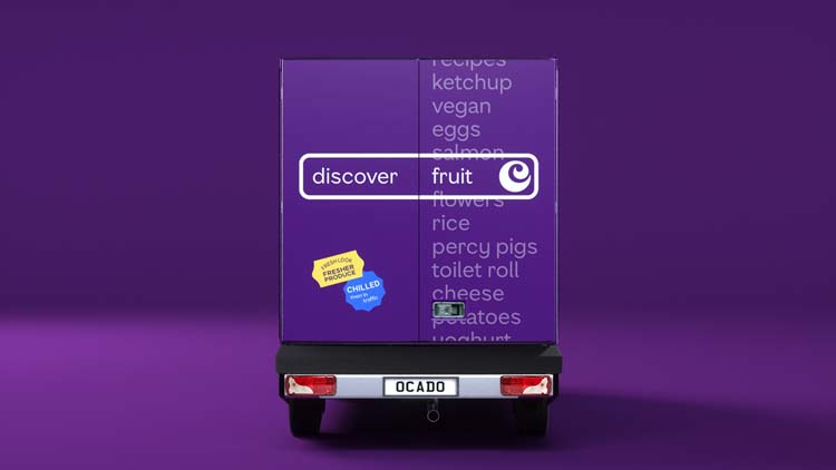
Other assets created by the brand include a search bar graphic which seeks to showcase just how many items Ocado offers. Different kinds of food and cuisines can be inputted into the search bar to show this variety.
These graphics have been designed to help Ocado’s in-house team continue to safeguard the brand. JKR also worked with the in-house team throughout the project, Robey says.
Mato says he is particularly excited to see how the in-house design team will utilise the assets on Ocado’s vans. The vans, he says, are one of the brand’s “strongest and most valuable assets”.
“With what we’ve done, I think the in-house team will be able to have some real fun with this space in the future,” he says.
Title (UPDATE) website link


An expensive – colour change